Mounting in Mybring Layout
How to mount apps in Mybring Layout and what it brings to the table
Mybring Layout delivers a standard element for app mounting and CSS for regional navigation.
The solution uses as few elements as possible with the goal of being flexible, unified and easier to read. Unification means central control over the common layout; this is to achieve better responsiveness and accessibility while maintaining the ability to improve over time without making double-digit number of local adjustments.
The mentioned parts of Mybring Layout are conceptually a part of Mybring Design System, but the two don’t share any code.
Mounting and structuring the base layout
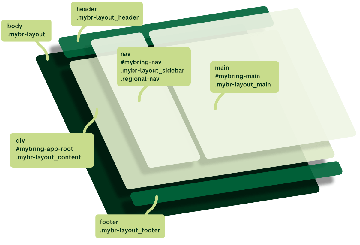
Mount apps on #mybring-app-root, which is provided by Mybring Layout. Inside
the apps, we add the direct children:
nav id="mybring-nav" class="mybr-layout__sidebar regional-nav"if the app has regional navigationmain id="mybring-main" class="mybr-layout__main"
Mybring Layout delivers all necessary CSS for the layout of the mentioned nav
and main elements together with CSS for the regional navigation.
The main element is the only place we use design system and custom CSS. The
mybring-main and mybring-nav ids are for global skiplinks. mybring-main is
mandatory for the skip to main content link to work when using keyboard
navigation.
When inspecting the code in the browser, the structure should be:
<body class="mybr-layout">
  <header class="mybr-layout__header">…</header>
  <div id="mybring-app-root" class="mybr-layout__content">
    <nav id="mybring-nav" class="mybr-layout__sidebar regional-nav" aria-label="{area name}">{Regional navigation list}<nav>
    <main id="mybring-main" class="mybr-layout__main">{App interface}</main>
  </div>
  <footer class="mybr-layout__footer">…</footer>
</body>
Technical anatomy
Mybring Layout defines layout via the body tag, where the class “mybr-layout” defines the layout system as grid.
It adds the header, a couple of rows for messages, the app area and the footer.
.mybr-layout {
  display: grid;
  min-height: 100vh;
  max-height: max-content;
  grid-template:
    'mb-header' auto
    'mb-appmessage' auto
    'mb-suverification' auto
    'mb-content' 1fr
    'mb-footer' auto
    / minmax(100%, 1fr);
}
The app area is what’s most relevant to us because that’s where our app is
mounted. It’s named mb-content in the grid template, and we find it in the
HTML with the class mybr-layout__content.
The grid template sets the element size to 1fr / minmax(100%, 1fr). The first
1fr means it should take up as much height as it needs but always fill the
remaining space, preventing the footer from having space below itself.
minmax(100%, 1fr) means that the minimum width of the page is 100 %, while it
will always fill the remaining space as well.
Layout and tables
With minmax(100%, 1fr), we get an essential thing for free: Any table set up
with overflow-x: auto, will scroll horizontally without affecting the rest of
the page. Check out the details on how we solve responsive
tables.